Introduction:
Are you ready to tackle one of the most common questions in the world of charts and graphs? Today, we're zooming in on a topic that might seem simple but is actually loaded with nuances - the difference between a bar chart and a histogram. Whether you're designing an interactive website or just love diving into data, understanding this distinction is crucial.By the end of this post, you'll not only grasp the concept but also be able to apply it like a pro in your web design projects. Let's demystify these charting tools and discover why knowing the difference between a bar chart and a histogram is a game-changer in the world of web design!
The Basics: Bar Chart vs Histogram
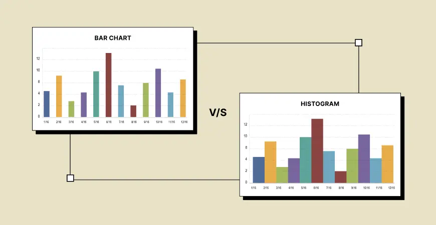
First off, let's define our terms. A bar chart is a graphical representation of data using bars of different heights or lengths. Each bar represents a category of data, and the height or length of the bar corresponds to the value or frequency of that category. On the other hand, a histogram is used to show the distribution of a continuous data set. It groups numbers into ranges and the height of each bar shows how many fall into each range.Also read: Download Best Ecommerce Web Template Free
Key Differences
Data Type: The primary difference between a bar chart and a histogram lies in the type of data they represent. Bar charts are used for categorical data (like countries, products, or age groups), while histograms are best for continuous data (like weight, height, or scores).Gaps Between Bars: In a bar chart, the bars are usually separated by gaps, which emphasize that each bar is a distinct category. In contrast, a histogram's bars touch each other, indicating the continuous nature of the data.Orientation: While both can be oriented horizontally or vertically, bar charts often vary in their orientation for stylistic or space reasons. Histograms are typically vertical, as this best represents the distribution of data.Axis Representation: In a bar chart, the categorical data is represented on one axis (usually the x-axis), with the numerical value on the other. In a histogram, both axes represent numerical values - one for the data range and the other for frequency.Explore now: Explore 2024's Top Web Design Trends: What's New and Next?
Examples for Clarity
Let's put the difference between a bar chart and a histogram into context with some examples:
Bar Chart Example: Imagine a website's traffic analysis. A bar chart could represent the number of visitors from different countries. Each bar would represent a country, and the height would show the number of visitors.Histogram Example: Now, consider the loading time of web pages in seconds. A histogram would group these times into intervals (e.g., 0-2 seconds, 2-4 seconds) and show how many pages load within each time range.
Application in Web Design
As a web designer, understanding the difference between a bar chart and a histogram is crucial. Depending on what you're trying to convey, choosing the right chart can significantly enhance the user experience. For instance, if you're presenting user demographics, a bar chart is your go-to. But, if you're analyzing performance data like page load times, a histogram would be more appropriate.
Advanced Considerations
When diving deeper into the difference between a bar chart and a histogram, consider aspects like the scale of measurement, customization options (like color coding or adding labels), and the intended audience's familiarity with these charts. A well-designed chart not only conveys data effectively but also aligns with the aesthetic and functional aspects of your website.
Conclusion:
In conclusion, understanding the difference between a bar chart and a histogram is essential for anyone in the field of web design. While they may seem similar at first glance, their applications and the type of data they represent are quite distinct. Remember, a bar chart is ideal for categorical data and emphasizes individual categories, while a histogram is perfect for showing the distribution of continuous data. By choosing the right type of chart, you can improve data presentation and enhance user engagement on your website. And that, dear readers, is the key to mastering the art of data visualization in web design!


