


Introduction to Bootstrap
Bootstrap is a well-known framework that helps developers build responsive websites quickly. It comes with ready-made components and styles that make it easier and faster to design web pages.
One of Bootstrap’s key strengths is that it makes sure your website looks good on all devices—from smartphones to large desktop screens. This helps create a smooth and consistent consumer experience.
Bootstrap includes helpful layout tools like fixed-width and full-width containers. These options let developers build flexible designs that work well across different screen sizes.
It supports many HTML elements and CSS features, which makes it a reliable and flexible tool for web development. Since Bootstrap is built with a mobile-first approach, your website will be ready to perform well on phones and tablets right from the start.
Bootstrap also offers a wide range of examples you can use in your own projects. These examples show how to build responsive layouts, customize designs, and add advanced features. By using them, developers can better understand how Bootstrap works and get new ideas for their own designs.
Some examples include fixed-width containers, masonry layouts, grid systems, and mobile-friendly designs. These help make your website look professional and easy to use.
Bootstrap also includes a layout option called container-fluid, which stretches across the full width of the screen. This is useful for creating modern, responsive designs that adjust smoothly on all devices and screen sizes.
In short, Bootstrap gives you everything you need to build flexible, clean, and mobile-ready websites that work well everywhere.
Bootstrap framework
Bootstrap is a popular and powerful tool that has changed the way developers build responsive websites. It includes a full set of CSS and JavaScript components that make it easy to design good-looking, consistent, and simple web pages.
One of Bootstrap’s biggest strengths is its responsive grid system. This system allows developers to create layouts that automatically adjust to different screen sizes—from phones to large desktop monitors.
With Bootstrap, developers can use ready-made components like navigation bars, buttons, forms, tables, and modals. These pre-built parts save time and help speed up the development process. Bootstrap is built with a mobile-first approach, meaning websites created with it work well on smartphones and tablets right from the start.
Bootstrap also works with many HTML elements and CSS properties, making it flexible for different types of projects.
Another great feature of Bootstrap is its easy customization. Developers can change colors, fonts, layouts, and more to match their brand or design needs. There are also many free and paid Bootstrap themes available, which provide ready-made designs you can quickly apply to your website.
Bootstrap ensures that your website looks the same across different web browsers. It uses Normalize.css to make sure styles are consistent, even in older browsers like Internet Explorer.
The framework is supported by a large, active community. This means there are frequent updates, strong documentation, and many tutorials and guides. Whether you’re just getting started or already experienced, Bootstrap is easy to learn and use.
The latest versions of Bootstrap include modern JavaScript features and no longer rely heavily on jQuery, making sites faster and more efficient.
In short, Bootstrap is a must-have tool for today’s web development. It offers ease of use, responsiveness, customization, and strong browser support. Whether you’re building a simple website or a complex app, Bootstrap gives you the tools to do it well and fast. It’s trusted by developers around the world for creating quality websites that work on all devices.
Benefits of Using Bootstrap
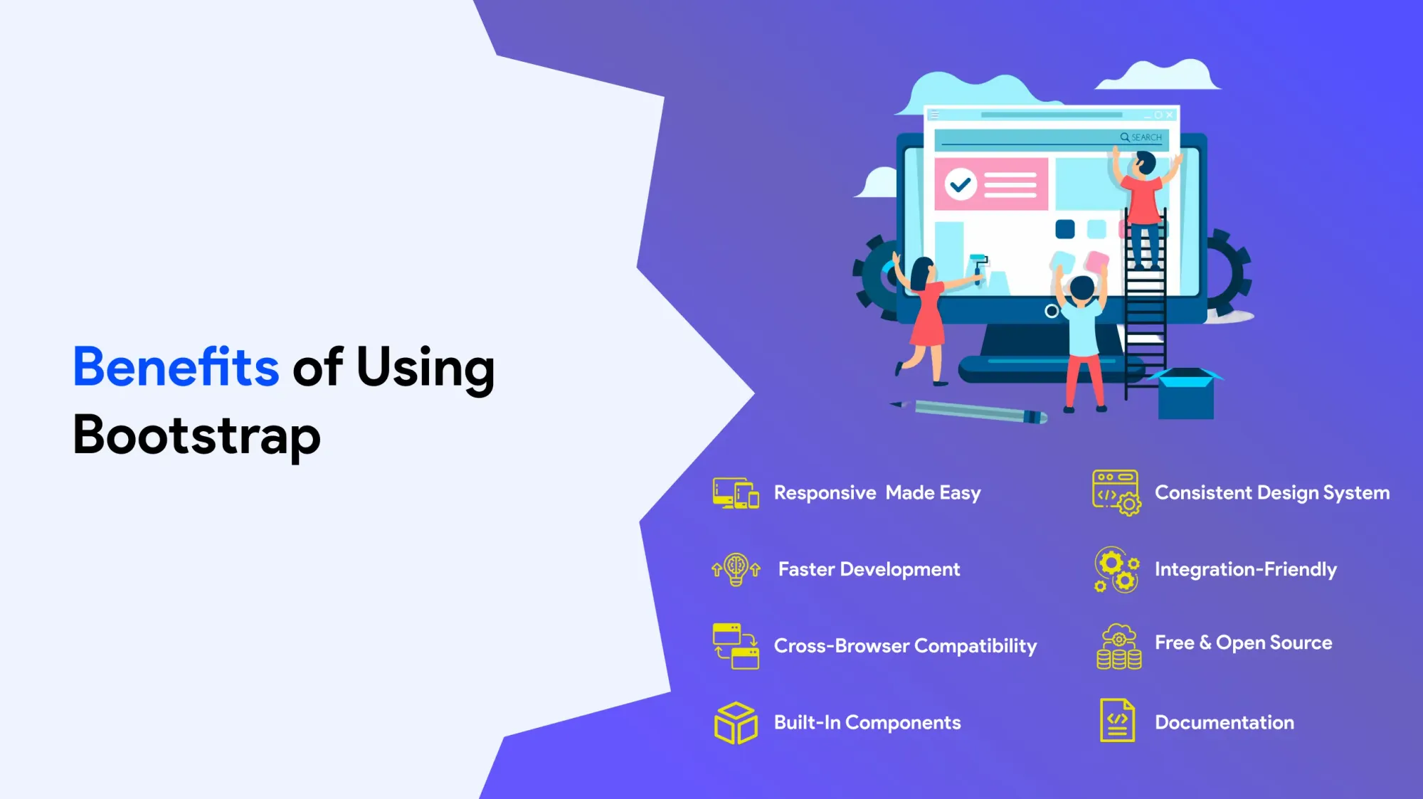
Bootstrap is a popular tool for building responsive websites. It includes a flexible grid system that helps developers easily create layouts that adjust to all screen sizes.
One of Bootstrap’s biggest advantages is its collection of pre-built parts like navigation menus, forms, tables, and modals. These ready-made parts save time and make it easier to build professional-looking websites.
Bootstrap also supports customization. Developers can change colors, fonts, layouts, and more to match a brand’s style. Many themes and templates are available—both free and premium—making it easy to start building without starting from scratch.
Why Templates Matter in Web Development
Templates are very useful in modern web design. They give developers a strong starting point with pre-designed layouts and parts. This helps speed up the development process and keeps design consistent across all pages.
Templates are great for quickly building professional websites. They come in many styles—ranging from simple landing pages to full online stores—and suit many industries and needs. Developers can find thousands of Bootstrap templates in online marketplaces.
Templates built with Bootstrap make full use of its mobile-first design, responsive grid system, and flexible containers. They work well on all devices, including smartphones, tablets, and desktops. This ensures a smooth and consistent consumer experience.
Most templates include useful features like navigation bars, modals, tables, and forms. These parts can be easily modify and extended using CSS and JavaScript, giving developers full control over the design and functionality.
Templates also help reduce errors and support best practices in responsive design. Even beginners can use templates to build attractive, simple websites without needing to code everything from scratch.
Bootstrap and Template Integration
Bootstrap’s compiled CSS and JavaScript files make it simple to get started. Developers can quickly plug in responsive features without complex setup. Templates built on Bootstrap take full advantage of these files, allowing both beginners and experts to build fast, mobile-ready websites.
Whether it’s a blog, business website, or e-commerce store, using templates cuts down development time and ensures the website looks good on all screens. Templates are also great for keeping your branding and layout consistent across different pages.
Many modern templates include updated Bootstrap 5 features like improved navigation bars, better form controls, and customizable modals. These updates give developers even more tools to build modern, responsive websites that meet today’s design standards.
Bootstrap Grid System
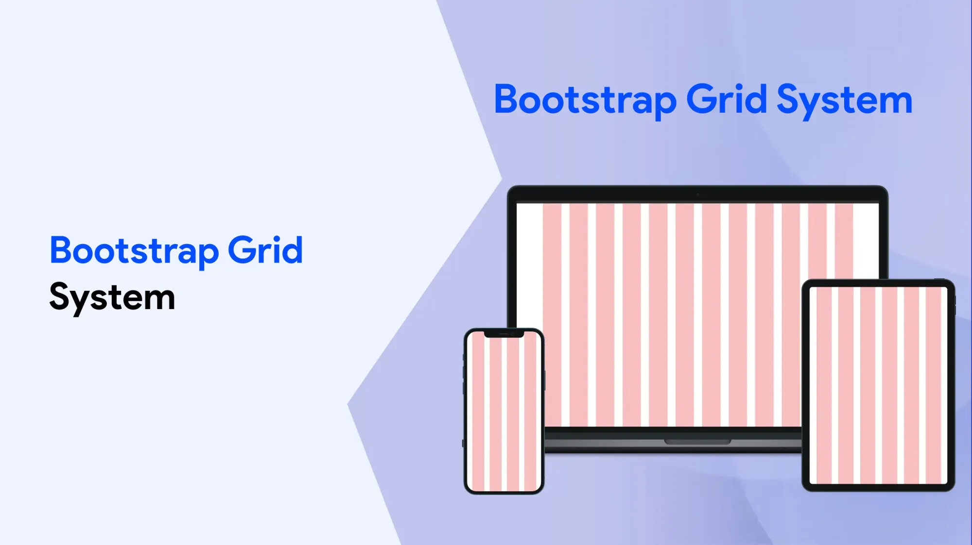
Bootstrap’s grid system is built on a 12-column layout. This makes it easy to create flexible and responsive designs that adjust smoothly to different screen sizes. It's a mobile-first system, which means layouts are designed to work well on small screens first, then scale up for larger ones.
A well-designed header is very important for any website. It appears at the top of every page and helps guide consumer as they move through your site. A good header should be clear, easy to use, and look the same across all pages. This builds brand recognition and improves the overall consumer experience. A responsive header also adjusts to different screen sizes so that navigation stays simple and accessible on all devices.
In design discussions, headers are often mentioned multiple times because of their critical role in navigation and branding—especially in Bootstrap-based projects.
Containers and rows are key parts of Bootstrap layouts. They help organize page structure and make sure content displays correctly on all devices, including smartphones and tablets. These parts assist touch zooming and ensure pages respond well to different screen sizes.
Links are also a major part of website navigation. When links are clear and easy to use, they help consumer move smoothly through the site. Well-placed links improve accessibility and connect content in a logical, simple way.
As consumer scroll through content, smooth scrolling effects can make the browsing experience more engaging and enjoyable. Managing how pages scroll is important for keeping users focused and helping them find what they need.
The Bootstrap grid system allows developers to build custom layouts. With features like push and pull, developers can shift columns left or right to create more complex page designs. This gives you greater control over how content is shown and helps build pages that look clean and well-organized.
For example:
- Pull moves content to the left
- Push moves content to the right
Using these features properly can help you highlight important information and improve how your site looks on different screens.
Bootstrap’s grid system works with all major browsers like Chrome, Firefox, and Safari. Thanks to this strong browser assist, your layouts will look and perform the same across devices.
Bootstrap also includes Normalize.css, which helps your site look consistent across different browsers. It smooths out differences in how browsers handle styles, so your site loads quickly and looks polished everywhere.
Responsive Design with Bootstrap
Bootstrap makes it easy to build websites that work well on all display sizes and devices. Its responsive design ensures your site looks great whether it’s viewed on a phone, tablet, or desktop.
The framework uses CSS media queries to adjust the layout based on the device’s display size. This helps create a smooth and simple experience across different platforms.
Responsive design is an important part of modern web development. It makes sure your website is easy to access and use no matter what device someone is using.
Bootstrap includes helpful responsive features like:
- Responsive images that automatically resize
- Responsive tables that scroll on small appearances
- Responsive forms that adjust to fit neatly on any device
These features help developers create websites that are simple to use and enjoyable for visitors.
In responsive design, the layout changes automatically so that the website always looks good. Bootstrap assists this by requiring a containing element—like a container or container-fluid—to wrap your website’s content and control its layout.
To ensure proper appearances on mobile devices, you also need to include the viewport meta tag. This tag tells mobile browsers how to scale and show your website correctly.
Responsive Fixed Width Container
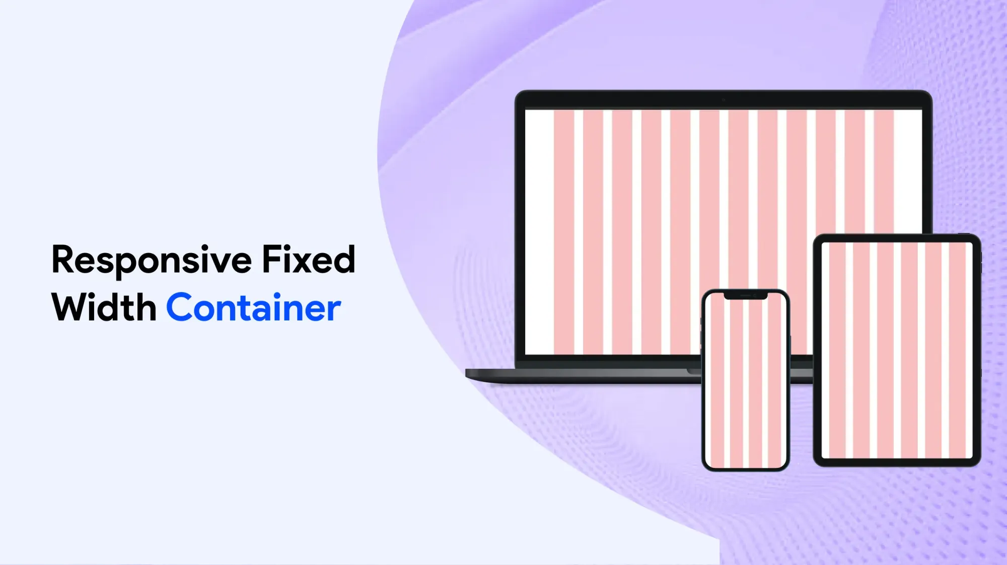
A responsive fixed-width container is one of the key elements in the Bootstrap framework. It wraps the website content in a neat layout while adjusting smoothly to different appearances sizes.
Unlike fluid containers that stretch across the full appearances, a fixed-width container has a set maximum width that changes based on the device’s appearance size. This helps create a consistent layout across all devices—whether it’s a smartphone, tablet, or large desktop appearances.
Using this type of container ensures that your content appearances properly and assists touch zooming on mobile devices. It also helps developers build pages that are visually balanced and easy to navigate.
Overall, responsive fixed-width containers help maintain good design and usability across all devices without compromising how the website looks or functions.
Masonry Layout
The masonry designs is a popular design technique used in Bootstrap to create visually appealing and dynamic grid structures. Unlike traditional linear layout, masonry arranges elements vertically, positioning them based on available vertical space, much like a bricklayer fitting stones in a wall.
This approach results in an efficient use of space without fixed row heights, making it ideal for portfolios, galleries, and content-heavy websites. Bootstrap supports masonry designs through its flexible grid system and CSS properties, allowing developers to create responsive, easy to use designs that adapt seamlessly to different display sizes and devices, enhancing the overall consumer experience.
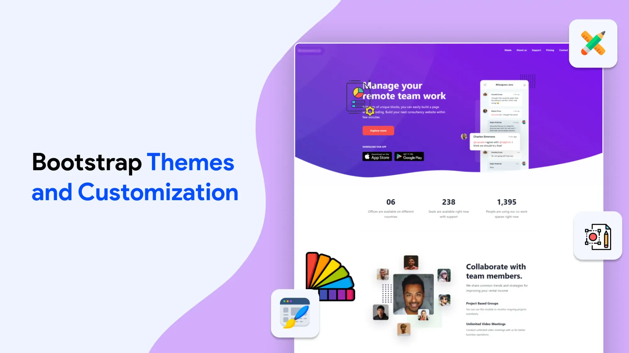
Bootstrap Themes and Customization
Bootstrap themes are a quick and easy way to change how a website looks and feels. They help developers create unique, user-friendly websites without building everything from scratch. With so many themes available, it’s easy to find one that fits your brand style or project needs whether you need a certain layout, color scheme, or design.
You can pick from a wide selection of ready-made Bootstrap themes or build your own custom version. This flexibility makes it possible to develop websites faster while still keeping them professional and polished. These themes often include extra features and plugins that go beyond the basic Bootstrap setup, helping developers create interactive and dynamic websites.
With Bootstrap, you can modify your site by changing colors, fonts, and layouts. This means your website can match your brand’s style and meet your users’ expectations. Using a theme saves time and effort so developers can focus more on the content and user experience, instead of spending hours on design.
Bootstrap also offers useful elements like navigation bars, forms, carousels, modals, and buttons. When you use a theme, these elements are styled consistently, giving your website a clean and unified appearance.
Whether you’re building a business site, an online store, or a personal blog, Bootstrap themes help you create personalized websites that stand out in a crowded online space.
You can find Bootstrap templates in online marketplaces, both free and paid. These themes are made for different industries and needs, so developers can choose the best one to get their project started fast.
Many companies choose Bootstrap themes because they are reliable, responsive, and easy to use. These themes also support mobile-first design, so your website works smoothly on all display sizes smartphones, tablets, and large desktops alike.
There are many free and premium Bootstrap themes available. Free themes are great for small projects or learning, while paid themes often come with more advanced features, regular updates, and customer support.
Bootstrap themes are built with smartphones in mind. The mobile-first design ensures websites look great and function well on mobile devices. Responsive containers and layouts automatically adjust to fit different display sizes, offering a smooth experience on any device.
You can use fixed-width containers to keep content neatly centered or use fluid containers that stretch across the full display for a more immersive design. This helps create pages that are both functional and attractive.
All themes use the Bootstrap grid system, which is based on 12 columns. This allows for flexible and complex layouts, including masonry-mode designs, which arrange content like bricks in a wall for a modern look.
Bootstrap themes also use Normalize.css to make sure your website looks consistent in all major browsers—like Chrome, Firefox, and Safari. While Bootstrap 5 dropped support for older browsers like Internet Explorer, some themes still offer backward compatibility for users who need it.
Themes also include features for touch zooming and proper display on smartphones. With the help of the viewport meta tag, websites automatically scale to fit the disguise size and zoom level of the user’s device.
Bootstrap themes speed up development by providing pre-designed layouts and elements. This is especially useful for projects with tight deadlines or limited resources.
Themes support many HTML elements and CSS elegance, including forms, tables, buttons, and images. These elements are essential for building easy-to-use, interactive websites.
Developers can also modify themes further by editing CSS or JavaScript files, or by using Bootstrap’s built-in variables and mixins. This means that even if you're using a pre-made theme, your site can still have a unique elegance.
Accessibility is also built into most Bootstrap themes. This includes support for disguise readers, keyboard navigation, and good color contrast—making your site easier to use for people with disabilities.
The Bootstrap community is large and active. You’ll find plenty of shared themes, plugins, and helpful resources. This support makes it easier for beginners to get started and for experienced developers to solve problems quickly.
To summarize, bootstrap themes:
Bootstrap themes offer many benefits that make web development faster and easier. Here's what they provide:
- A quick and simple way to modify the look and feel of websites
- A wide selection of pre-built and customizable designs
- Built-in elements and plugins to add extra features
- Mobile-first design, optimized for smartphones and tablets
- Support for both consistent-width and full-width responsive containers
- A flexible layout system powered by the Bootstrap grid
- Compatibility across all major browsers, including Internet Explorer
- Faster development with consistent, professional design
- Accessibility features and support from a large global community
- Free and premium options available in popular digital marketplaces
By using Bootstrap themes in your next project, you can take advantage of a trusted framework while creating websites that are both functional and visually appealing. Whether you’re new to web development or highly experienced, Bootstrap themes give you the tools and freedom to build modern, simple websites with ease.
Mobile Devices and Bootstrap
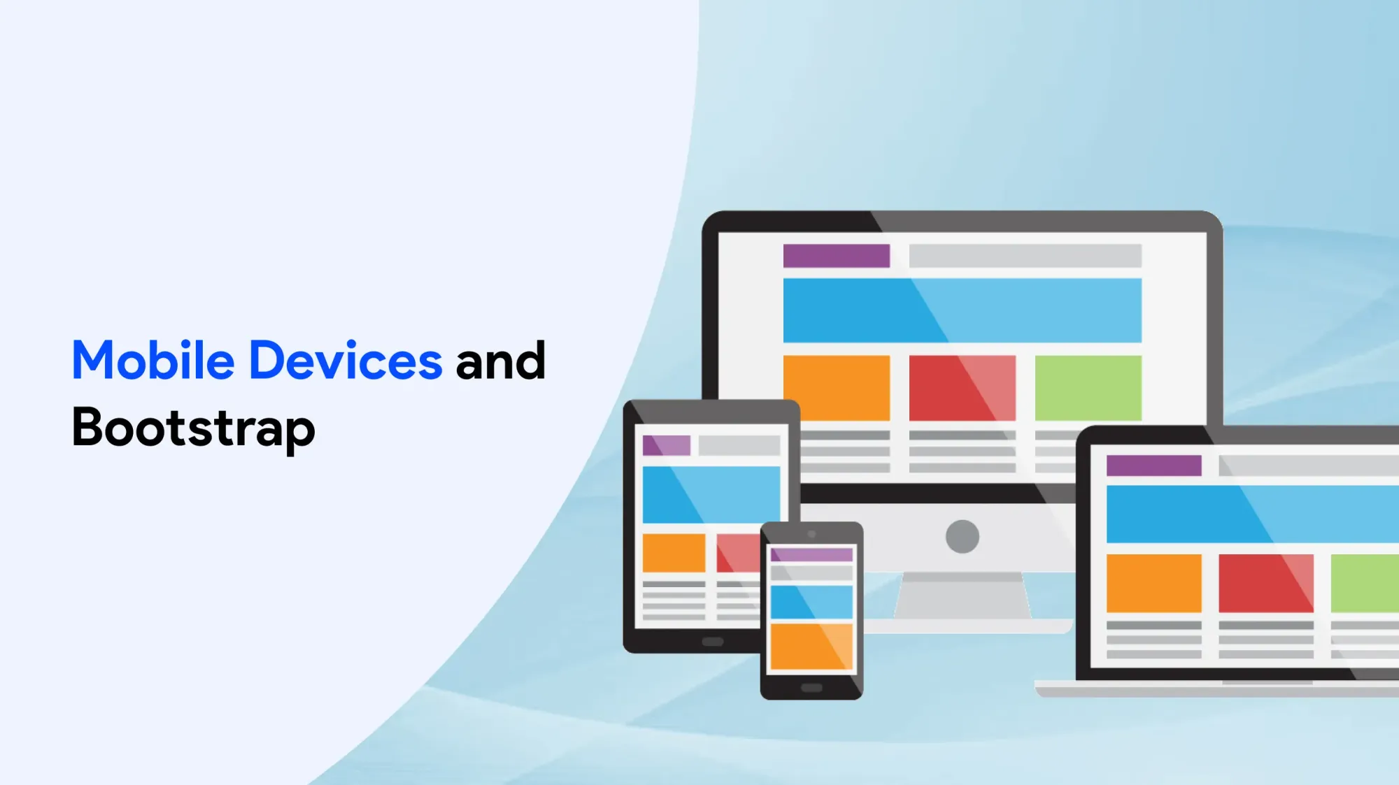
Bootstrap is built with a mobile-first approach, meaning websites are designed to work well on small disguise like smartphones and tablets before scaling up to larger devices.
The framework includes many features and elements that are specially made for mobile use. This includes responsive layouts, touch-friendly elements, and optimized performance for lower disguise.
Bootstrap’s responsive design ensures that websites adjust smoothly to different cover sizes, providing a consistent and user-friendly experience across all devices.
Developers can use Bootstrap to build websites that are easy to navigate and deliver a strong user experience on mobile. This is especially important for brands, as many consumers browse and shop using smartphones.
By focusing on mobile-first design, Bootstrap helps businesses create websites that load quickly, look great, and engage customers on smartphones and tablets.
Advanced Layouts with Bootstrap
Bootstrap offers a variety of advanced layout options, including masonry-mode designs and linear layouts. These features help developers build unique and eye-catching websites that stand out.
Using Bootstrap’s layout system, developers can create complex and personalized designs tailored to the needs of any project. The framework supports modern client-side technologies like Flexbox, which makes it easier to build flexible, responsive layouts.
These advanced options allow developers to build websites that are not only visually appealing but also easy to use and fully responsive across all devices.
To support these features, Bootstrap uses HTML5 elements and client-side scripting, which means your HTML files must include the HTML5 doctype at the top. This ensures everything works correctly and displays consistently across browsers.
In short, Bootstrap’s advanced layout tools give developers the power to build professional, responsive, and simple websites with modern design features.
Getting Started with Bootstrap
Getting started with Bootstrap is straightforward, thanks to the many resources and guides available.
Developers can download the Bootstrap framework and begin using it right away. It comes with a wide selection of examples and code snippets to help you build responsive websites quickly.
The official documentation includes step-by-step tutorials and guides that make it easy to learn how to use Bootstrap effectively, even if you're new to web development.
Using these resources, developers can create responsive and simple websites with minimal setup and effort.
By default, Bootstrap uses a global font size of 14px and a line height of 1.428, which ensures readable and well-spaced text across all devices.
Best Practices and Conclusion
Best practices for using Bootstrap include using the framework’s receptive design features and mobile-first approach.
Developers should also use Bootstrap’s themes and customization options to create unique and personalized websites.
The framework’s advanced layout options and elements can be used to create complex and personalized layouts.
Bootstrap’s community of developers and extensive documentation make it a popular and widely-used framework.
By following best practices and using Bootstrap’s features and elements, developers can create receptive, easy to use, and visually appealing websites.
The main differences between Bootstrap 5 and Bootstrap 3 & 4 is that Bootstrap 5 has switched to JavaScript instead of jQuery.


