

Shopify theme development changed in a big way with the launch of Online Shop 2.0 in June 2021. This update added full CSS Grid support to millions of shops. Thanks to this, developers can now build advanced, responsive designs without needing to use complicated flexbox structures or old float-based methods. Using Easy Content Builder can also save a lot of time when setting up a shop, which is helpful for both developers and shop owners.
Today, CSS Grid is at the heart of modern Shopify themes. It gives developers great control over lines and columns and helps pages load faster. If you’re building custom sections for your shop or creating themes for clients, learning CSS Grid is a must. Easy Content Builder, a free Shopify app, makes it even easier to build and manage layouts.
This guide will show you how to use CSS Grid in your Shopify projects. You’ll learn everything from setting up your first grid layout to using advanced techniques for responsive design. We’ll also show you how to make dynamic sections that shop owners can change in the theme editor. Easy Content Builder helps you create multi-column layouts with sections and blocks, so designing complex pages becomes simpler.
Understanding CSS Grid for Shopify Development
CSS Grid has changed the way we build web page layouts. Unlike older methods that required complex solutions, CSS Grid is a robust two-dimensional layout system that has been supported in all modern browsers since 2017. For Shopify developers, this means you can write cleaner code that’s easier to manage, works better, and loads faster. CSS Grid also offers new styling options to control cell sizes and item placement, making it a flexible tool for today’s web design. With Easy Content Builder, you can easily set up layouts for both desktop and mobile, helping your designs work well on all devices.
Shopify Online Store 2.0 was a big step forward for theme building. This update added full support for modern CSS, making Grid the best choice for creating custom layouts in both static templates and sections that shop owners can change. Shopify now fully supports CSS Grid, so developers can create more advanced layouts without slowing down the site. Easy Content Builder offers many ready-made sections you can combine to speed up your design work.
Why CSS Grid Matters for Your Shopify Shop
CSS Grid layouts have many benefits compared to older layout methods:
- Simpler code: You can replace complex flexbox setups with easy-to-read grid code.
- Better performance: Less complicated code means pages load faster.
- More control: You can adjust spacing both across and down the page at the same time.
- Responsive design: Your layouts will work well on all screen sizes.
- Easy for shop owners: Shop owners can change layouts themselves using the theme editor.
Since 2021, more and more Shopify themes have started using CSS Grid. This is because it gives developers more creative freedom and helps shops run faster. Today, about 95% of users are on browsers that fully support grid features, so it’s a great time to switch. Pages built with CSS Grid usually have cleaner HTML, which makes them easier to build and maintain. You can also make one-column layouts with Easy Content Builder, even if you don’t have programming skills, so it’s useful for many people.
Setting Up Your First CSS Grid in Shopify
Getting started with a CSS grid formation on Shopify begins with understanding the file structure and creating the necessary components. The process is straightforward once you know where to place your program and how to integrate it with Shopify’s templating system. Easy Content Builder allows for the adjustment of white space between columns and lines, giving you even more control over the final layout.
The app saves you tons of time when creating multiple-column layouts. Simplifying the process allows developers and merchants to quickly build responsive, visually appealing grid designs that enhance user experience and boost sales.
Creating the Section File
Start by making a new Liquid file inside your theme’s sections folder. This file will hold both the HTML layout and the settings that let shop owners change the grid using the theme editor. With Easy Content Builder, you can either customise an existing Shopify theme or create a new page from the ground up. This gives you flexibility for different types of projects.
<!-- sections/grid-layout.liquid -->
<div class="grid-container">
{% for block in section.blocks %}
<div class="grid-item">
{{ block.settings.content }}
</div>
{% endfor %}
</div>
{% schema %}
{
"name": "Grid Layout",
"settings": [
{
"type": "range",
"id": "columns",
"min": 1,
"max": 4,
"step": 1,
"label": "Number of columns",
"default": 3
}
],
"blocks": [
{
"type": "content",
"name": "Content Block",
"settings": [
{
"type": "richtext",
"id": "content",
"label": "Content"
}
]
}
],
"presets": [
{
"name": "Grid Layout",
"blocks": [
{"type": "content"},
{"type": "content"},
{"type": "content"}
]
}
]
}
{% endschema %}
Defining the CSS Grid
In your theme’s stylesheet (usually called theme.scss.liquid or another CSS file), set up the grid container with the basic properties it needs. With Easy Content Builder, you can easily place ready-made sections into each column of your layout. This makes it simpler to build pages that are both dynamic and good-looking.
.grid-container {
display: grid;
grid-template-columns: repeat({{ section.settings.columns }}, 1fr);
gap: 2rem;
padding: 2rem 0;
}
.grid-item {
background: #f8f8f8;
padding: 1.5rem;
border-radius: 8px;
}
This basic setup creates a grid that adjusts to different screen sizes. Shop owners can choose how many columns they want through the Shopify theme editor. The 1fr unit makes sure all columns are the same width, and the gap property adds even space between items. The fr unit works well in CSS Grid because it sets the size of each cell based on the available space, helping you build balanced, flexible layouts. Easy Content Builder makes it easy to design page layouts from the ground up, so it’s a great tool for both developers and shop owners.
Key CSS Grid Properties for Shopify Themes
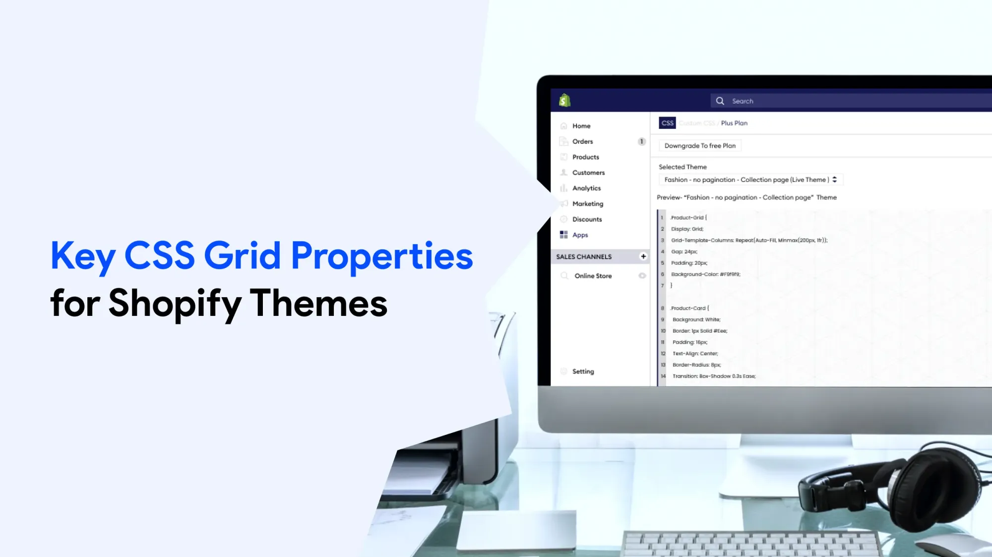
Knowing the main CSS Grid properties helps you build layouts that are easy to manage and work well on all screen sizes. These properties let you control where and how your content appears.
Managing Columns and Lines
The grid-template-columns property is the main way to set up the horizontal part of your grid. You can use different units and functions to get the layout you want.
/* Equal width columns */
.product-grid {
grid-template-columns: repeat(3, 1fr);
}
/* Mixed width columns */
.feature-section {
grid-template-columns: 2fr 1fr 1fr;
}
/* Responsive columns with minimum width */
.collection-grid {
grid-template-columns: repeat(auto-fit, minmax(250px, 1fr));
}
Similarly, grid-template-lines controls the vertical structure. For most Shopify applications, you’ll often let lines auto-size based on content, but explicit control can be useful for maintaining consistent layouts:
.testimonial-grid {
grid-template-rows: auto 1fr auto;
min-height: 300px;
}
Grid Areas and Positioning
For more advanced layouts, grid-template-areas lets you visually plan your grid structure. It works together with grid-area, which lets you give names to different parts of the grid. This makes it easier to organise, manage, and clearly adjust your layout.
.homepage-hero {
display: grid;
grid-template-areas:
"image content content"
"image features features";
grid-template-columns: 1fr 2fr;
gap: 2rem;
}
.hero-image { grid-area: image; }
.hero-content { grid-area: content; }
.hero-features { grid-area: features; }
This method makes it simple to build uneven or creative layouts while keeping your CSS clean and easy to manage.
Alignment and Spacing
You can control how content lines up inside grid cells by using justify-items and align-items:
.product-card-grid {
display: grid;
grid-template-columns: repeat(auto-fit, minmax(200px, 1fr));
gap: 1.5rem;
justify-items: center; /* Center items horizontally */
align-items: start; /* Align items to top */
}
The gap property (or the older grid-gap) is important for adding even spacing between items. You can set different gap sizes for lines and columns if needed:
.blog-grid {
gap: 2rem 1rem; /* 2rem line gap, 1rem column gap */
}
Creating Responsive Grid Layouts
Responsive design is very important for any Shopify shop. CSS Grid is great at making layouts that look good on all devices. The trick is to use Grid’s built-in responsive features along with media queries. By using grid-template-columns with media queries, you can easily adjust your layout for different screen sizes.
Auto-Fitting Columns
One of the best things about CSS Grid is that it can automatically adjust the number of columns based on the space available:
.responsive-product-grid {
display: grid;
grid-template-columns: repeat(auto-fit, minmax(280px, 1fr));
gap: 1.5rem;
}
This program sets up a grid where:
- Columns automatically fit into the available space
- Each column is at least 280px wide
- Columns grow equally to fill any extra space
- The layout stacks into one column when there isn’t enough room
Mobile-First Approach
Begin with a simple, mobile-friendly single-column layout. Then, add styles to improve the layout for bigger screens:
.content-grid {
display: grid;
grid-template-columns: 1fr;
gap: 1rem;
@media (min-width: 768px) {
grid-template-columns: repeat(2, 1fr);
gap: 1.5rem;
}
@media (min-width: 1024px) {
grid-template-columns: repeat(3, 1fr);
gap: 2rem;
}
}
Dynamic Column Control
For Shopify themes, you’ll often want to give merchants control over the number of columns through the theme editor:
<!-- In your section file -->
<style>
.custom-grid-{{ section.id }} {
display: grid;
grid-template-columns: repeat({{ section.settings.desktop_columns }}, 1fr);
gap: {{ section.settings.grid_gap }}px;
}
@media (max-width: 768px) {
.custom-grid-{{ section.id }} {
grid-template-columns: repeat({{ section.settings.mobile_columns }}, 1fr);
}
}
</style>
This method lets shop owners exchange their layouts without needing to edit the program. It also makes sure the design stays responsive and works well.
Using Grid in Shopify Section Files
To use CSS Grid in Shopify sections, you need to know how to combine the Liquid program with CSS Grid styles. The aim is to build flexible layouts that shop owners can adjust, while keeping the design clean, no matter what content is added.
Schema Settings for Grid Control
A good section schema gives shop owners simple and clear options to control grid settings:
{
"name": "Product Showcase Grid",
"settings": [
{
"type": "range",
"id": "columns_desktop",
"min": 1,
"max": 4,
"step": 1,
"label": "Desktop columns",
"default": 3
},
{
"type": "select",
"id": "columns_mobile",
"label": "Mobile columns",
"options": [
{"value": "1", "label": "1 column"},
{"value": "2", "label": "2 columns"}
],
"default": "1"
},
{
"type": "range",
"id": "grid_spacing",
"min": 0,
"max": 60,
"step": 4,
"unit": "px",
"label": "Grid spacing",
"default": 24
}
]
}
Dynamic CSS Generation
You can use Liquid variables to create CSS that changes based on the settings chosen by the shop owner. This helps make sure the design stays responsive and adjusts as needed:
<style>
.product-showcase-{{ section.id }} {
display: grid;
grid-template-columns: repeat({{ section.settings.columns_desktop }}, 1fr);
gap: {{ section.settings.grid_spacing }}px;
padding: 2rem 0;
}
@media (max-width: 768px) {
.product-showcase-{{ section.id }} {
grid-template-columns: repeat({{ section.settings.columns_mobile }}, 1fr);
gap: {{ section.settings.grid_spacing | divided_by: 2 }}px;
}
}
</style>
<div class="product-showcase-{{ section.id }}">
{% for block in section.blocks %}
<div class="grid-item" {{ block.shopify_attributes }}>
{% case block.type %}
{% when 'product' %}
{% render 'product-card', product: block.settings.product %}
{% when 'image' %}
<img src="{{ block.settings.image | img_url: '400x400' }}" alt="{{ block.settings.image.alt }}">
{% when 'text' %}
<div class="text-content">{{ block.settings.content }}</div>
{% endcase %}
</div>
{% endfor %}
</div>
Handling Variable Content
A common challenge with grid layouts is dealing with content of different lengths. You can use CSS Grid properties to keep the layout looking neat and consistent:
.grid-item {
display: flex;
flex-direction: column;
min-height: 100%;
.content {
flex-grow: 1;
}
.button {
margin-top: auto;
}
}
This method makes sure that call-to-action buttons line up at the bottom of each grid item, no matter how much content is inside.
Common Grid Layout Patterns for Shopify
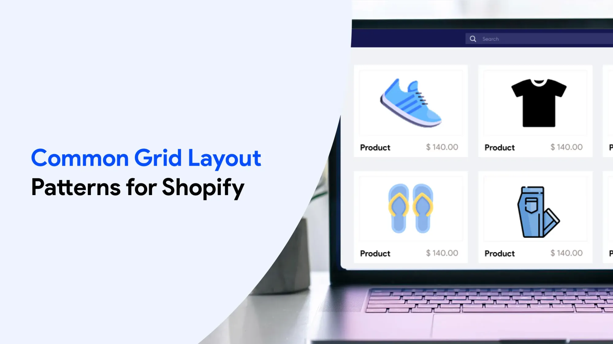
Knowing common grid patterns helps you build good layouts faster and gives you a starting point for more advanced designs. These patterns work well for an online shop and can be adjusted for different kinds of content.
Product Collection Grid
One of the most common ways to use CSS Grid in Shopify is to show products on collection pages:
.collection-grid {
display: grid;
grid-template-columns: repeat(auto-fit, minmax(280px, 1fr));
gap: 2rem 1.5rem;
.product-card {
display: grid;
grid-template-rows: auto 1fr auto auto;
gap: 1rem;
.product-image { grid-row: 1; }
.product-title { grid-row: 2; }
.product-price { grid-row: 3; }
.product-actions { grid-row: 4; }
}
}
This pattern builds a product grid that adjusts to screen size. Each product card stays the same shape and lines up nicely, no matter how many products are in a line.
Feature Section Layout
For marketing or promotional content, using uneven (asymmetric) grids makes the design more eye-catching:
.feature-section {
display: grid;
grid-template-columns: 1fr 1fr;
grid-template-rows: auto auto;
gap: 2rem;
.featured-item {
grid-column: 1 / 3;
grid-row: 1;
}
.supporting-item:nth-child(2) { grid-column: 1; grid-row: 2; }
.supporting-item:nth-child(3) { grid-column: 2; grid-row: 2; }
@media (max-width: 768px) {
grid-template-columns: 1fr;
.featured-item,
.supporting-item {
grid-column: 1;
}
}
}
Blog Post Grid with Variable Heights
For showing blog posts or articles, CSS Grid works well because it can handle content with different lengths:
.blog-grid {
display: grid;
grid-template-columns: repeat(auto-fit, minmax(350px, 1fr));
gap: 2rem;
.blog-card {
display: grid;
grid-template-rows: 200px auto 1fr auto;
gap: 1rem;
border: 1px solid #eee;
padding: 1.5rem;
.featured-image {
grid-row: 1;
object-fit: cover;
width: 100%;
height: 100%;
}
.post-title { grid-row: 2; }
.post-excerpt { grid-row: 3; }
.post-meta { grid-row: 4; }
}
}
Testimonial Grid
Customer testimonials work well with flexible grid layouts that can handle quotes of different lengths:
.testimonial-grid {
display: grid;
grid-template-columns: repeat(auto-fit, minmax(300px, 1fr));
gap: 2rem;
.testimonial {
display: grid;
grid-template-rows: 1fr auto;
gap: 1rem;
padding: 2rem;
background: #f9f9f9;
.quote {
grid-row: 1;
align-self: start;
}
.attribution {
grid-row: 2;
align-self: end;
}
}
}
Troubleshooting and Best Practices
Even with CSS Grid’s intuitive nature, developers encounter common issues when implementing grid layouts in Shopify themes. Understanding these challenges and their solutions will help you create a more robust, maintainable program.
Common Grid Issues and Solutions
Grid Items Not Aligning Properly
When grid items don’t align as expected, the issue often stems from conflicting CSS rules or incorrect grid property usage:
/* Problem: Mixed layout methods */
.grid-container {
display: grid;
display: flex; /* This overrides grid */
}
/* Solution: Use only grid properties */
.grid-container {
display: grid;
grid-template-columns: repeat(3, 1fr);
align-items: start;
}
Content Overflow in Grid Items
Long text or big images can mess up grid layouts. You can use these tips to keep sizes consistent:
.grid-item {
min-width: 0; /* Allows text to wrap properly */
overflow-wrap: break-word;
img {
max-width: 100%;
height: auto;
object-fit: cover;
}
}
Inconsistent Heights Across Lines
When grid items have different amounts of content, you can use align-items and flexbox inside the grid items to keep everything looking neat and even:
.grid-container {
display: grid;
grid-template-columns: repeat(auto-fit, minmax(250px, 1fr));
align-items: stretch; /* Makes all items same height */
}
.grid-item {
display: flex;
flex-direction: column;
.content {
flex-grow: 1;
}
}
Performance Optimization
CSS Grid layouts usually work faster than older layout methods, but you can make them even better with a few extra steps:
/* Use transform for animations instead of changing grid properties */
.grid-item {
transition: transform 0.3s ease;
}
.grid-item:hover {
transform: translateY(-4px);
}
/* Avoid deeply nested grids */
.outer-grid {
display: grid;
grid-template-columns: repeat(2, 1fr);
}
/* Instead of nesting, use a larger grid */
.single-grid {
display: grid;
grid-template-columns: repeat(4, 1fr);
}
Debugging Grid Layouts
Modern browser developer tools provide excellent CSS Grid debugging capabilities:
- Chrome DevTools: Enable “Show line names” and “Show area names” in the Grid inspector
- Firefox DevTools: Use the Grid Inspector to visualise grid lines and areas
- CSS Grid Inspector: Shows exact measurements and spacing
Accessibility Considerations
Ensure your grid structure remains accessible across all devices and assistive technologies:
.grid-container {
display: grid;
grid-template-columns: repeat(auto-fit, minmax(280px, 1fr));
/* Ensure focus indicators remain visible */
.grid-item:focus-within {
outline: 2px solid #0066cc;
outline-offset: 2px;
}
}
/* Maintain logical tab order */
.grid-item {
/* Use CSS order sparingly to avoid breaking tab order */
order: initial;
}
Always check your grid structure with keyboard navigation and screen readers to make sure they work well for all users.
Browser Support and Fallbacks
CSS Grid works in almost all modern browsers, but you might still need backup styles for older browsers:
.grid-container {
/* Fallback for older browsers */
display: flex;
flex-wrap: wrap;
gap: 1rem;
/* Modern grid structure */
@supports (display: grid) {
display: grid;
grid-template-columns: repeat(auto-fit, minmax(250px, 1fr));
}
}
.grid-item {
/* Fallback sizing */
flex: 1 1 calc(33.333% - 1rem);
@supports (display: grid) {
flex: none;
}
}
Advanced Grid Techniques for Shopify
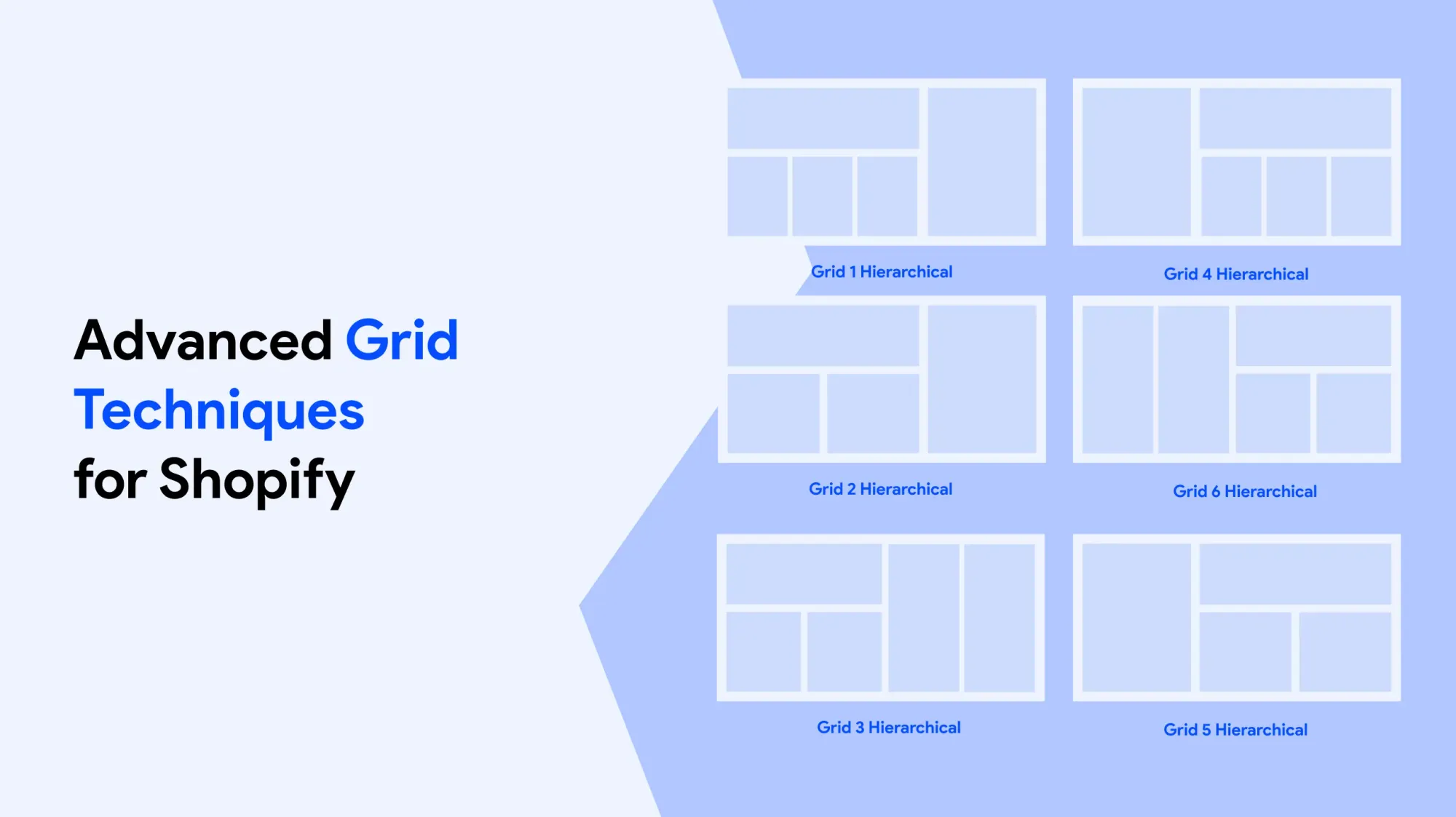
After you’ve learned the basics of CSS Grid, there are advanced methods that give you more creative options for your Shopify themes. These help you build smarter layouts that adjust well to different types of content.
Overlapping Grid Elements
You can design eye-catching layouts by making elements overlap inside the grid:
.hero-section {
display: grid;
grid-template-columns: repeat(6, 1fr);
grid-template-rows: repeat(4, 100px);
gap: 1rem;
.hero-image {
grid-column: 1 / 5;
grid-row: 1 / 4;
z-index: 1;
}
.hero-content {
grid-column: 3 / 7;
grid-row: 2 / 5;
z-index: 2;
background: rgba(255, 255, 255, 0.95);
padding: 2rem;
}
}
This technique works particularly well for promotional banners and feature sections where you want text to overlay images with precise positioning control.
Dynamic Grid Areas with Liquid Logic
Combine Shopify’s liquid templating with CSS Grid to create layouts that swap based on available content:
{% assign content_blocks = section.blocks | where: 'type', 'content' %}
{% assign image_blocks = section.blocks | where: 'type', 'image' %}
<style>
.dynamic-grid-{{ section.id }} {
display: grid;
{% if content_blocks.size > image_blocks.size %}
grid-template-columns: 2fr 1fr;
grid-template-areas: "content images";
{% else %}
grid-template-columns: 1fr 2fr;
grid-template-areas: "images content";
{% endif %}
gap: 2rem;
}
</style>
CSS Custom Properties for Theme Integration
You can connect your grid structure with Shopify’s theme settings by using CSS custom properties (also called variables):
<style>
: root {
--grid-columns: {{ settings.default_grid_columns }};
--grid-gap: {{ settings.grid_spacing }}px;
--grid-mobile-columns: {{ settings.mobile_grid_columns }};
}
.theme-integrated-grid {
display: grid;
grid-template-columns: repeat(var(--grid-columns), 1fr);
gap: var(--grid-gap);
}
@media (max-width: 768px) {
.theme-integrated-grid {
grid-template-columns: repeat(var(--grid-mobile-columns), 1fr);
}
}
</style>
Masonry-Style Layouts
Even though full masonry support is still limited, you can create layouts that look like masonry for certain types of content:
.masonry-grid {
display: grid;
grid-template-columns: repeat(auto-fit, minmax(250px, 1fr));
grid-auto-rows: 10px;
gap: 1rem;
.masonry-item {
display: flex;
flex-direction: column;
&.tall { grid-row: span 20; }
&.medium { grid-row: span 15; }
&.short { grid-row: span 10; }
}
}
For real masonry layouts, you can use JavaScript libraries. But this CSS method works fine when your content sizes don’t swap too much.
Subgrid Implementation (Future-Proofing)
Although not fully supported yet, subgrid will make it possible to build more advanced nested layouts in the future:
/* Future implementation when supported */
.parent-grid {
display: grid;
grid-template-columns: repeat(3, 1fr);
gap: 2rem;
}
.child-grid {
display: grid;
grid-template-columns: subgrid;
grid-template-rows: subgrid;
}
For now, plan your grid structures with subgrid in mind, but implement using current techniques.
Online Store 2.0
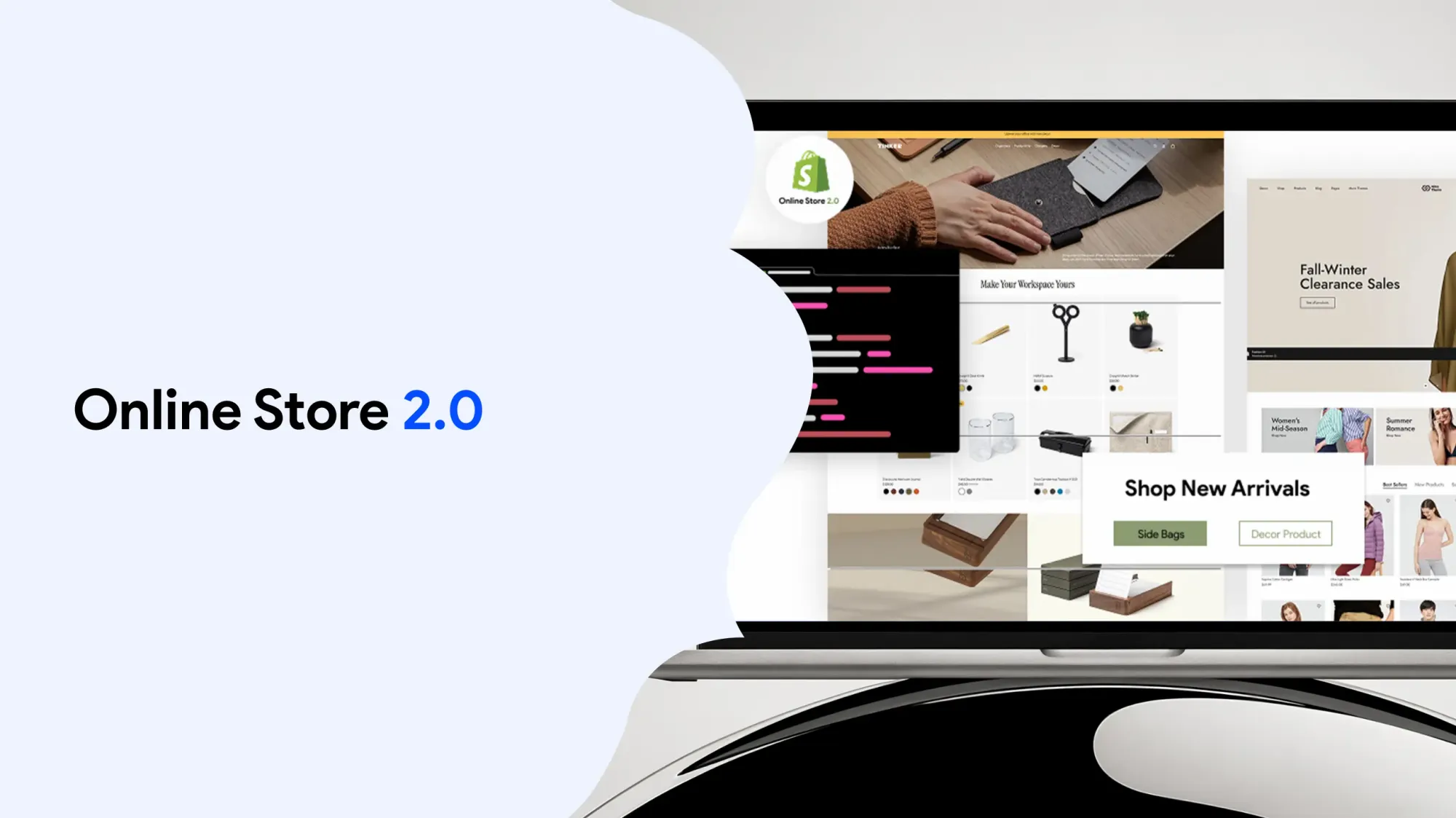
Launched in June 2021, Shopify’s Online Shop 2.0 revolutionised theme development by fully supporting modern CSS, including CSS Grid. It empowers developers with enhanced customisations, flexible sections, and blocks, making it easier to build responsive, dynamic layouts. This update streamlines shop design and improves user experience across devices.
Easy Content Builder is a free Shopify app that helps you create stunning CSS grid layouts effortlessly. With this free tool, you can build responsive, multi-column designs that enhance your store’s user experience.
When working with CSS Grid on Shopify, following best practices ensures your layouts are clean and responsive. Adhering to these practices helps maintain consistency across devices and improves performance. By incorporating proven practices into your development workflow, you create more efficient, user-friendly Shopify themes that stand the test of time.
One major advantage of using CSS Grid in Shopify themes is the ability to create flexible, responsive layouts that adapt seamlessly to different screen sizes, enhancing user experience and boosting overall shop performance.
Collection Page
The collection page is a crucial part of any Shopify shop, showcasing grouped products in an organised grid design. Using CSS Grid, you can create a flexible, responsive collection surface that adjusts to different screen sizes. This enhances user experience by making product browsing intuitive and visually appealing, boosting sales potential.
When customising your Shopify store, editing the theme files is essential to implement advanced CSS grid layouts. Properly managing theme files ensures your grid designs are responsive, maintainable, and seamlessly integrated with your store’s content.
When designing grille layouts for Shopify, adjusting column sizes to a larger width can significantly enhance the visual hierarchy and user experience. A larger width allows key content to stand out, making the layout more engaging and easier to navigate. This flexibility is essential for creating balanced, responsive designs.
Theme Editor
The Shopify theme editor offers a user-friendly interface for customising your store’s design without coding. It allows merchants to adjust layouts, colours, fonts, and content blocks easily. With CSS Grid integration, the theme editor provides flexible control over grid columns and spacing, enabling dynamic, responsive page layouts tailored to your brand’s needs.
When designing effective page layouts for your Shopify store, understanding how to structure content is essential. Well-crafted page layouts enhance user experience and guide visitors through your site seamlessly.
CSS Grid is a powerful tool that allows you to create flexible and responsive page layouts tailored to your brand’s needs. By mastering CSS Grid, you can build page layouts that adapt smoothly across devices and screen sizes.
Whether you’re working on product pages or landing pages, thoughtful page layouts improve engagement and conversion. Investing time in learning how to create dynamic page layouts will elevate your Shopify store’s design and functionality.
Conclusion
Getting started with a CSS grid design on Shopify opens up a world of design possibilities that were previously complex or impossible to achieve with traditional layout methods. From simple product grids to sophisticated asymmetric layouts, CSS Grid provides the foundation for creating professional, responsive themes that perform well and give merchants the control they need.
The key to success with CSS Grid in Shopify development lies in understanding both the technical capabilities of the layout system and the specific requirements of ecommerce design. By combining CSS Grid’s powerful features with Shopify’s flexible templating system, you can create themes that are not only visually appealing but also maintainable and user-friendly.
Remember that CSS Grid is not just about creating layouts—it’s about creating better user experiences. When customers can quickly find and interact with products, when content displays beautifully across all devices, and when merchants can easily customise their store’s appearance, everyone benefits.
As you continue to experiment with CSS Grid in your Shopify projects, focus on building reusable patterns and components that you can adapt for different use cases. The investment in learning these techniques will pay dividends as you create more sophisticated and successful online stores.
Start experimenting with CSS Grid in your next Shopify project and experience the difference firsthand. Your future self—and your clients—will thank you for making the transition to this powerful, modern layout system.


